

Is painting walls and trim the same color okay for us to do?
![painting walls and trim same color [black]](https://www.jimenezphoto.com/wp-content/uploads/2017/11/painting-walls-and-trim-same-color-black-613x410.jpg)
Will it create the boring look in our interior space?
Maybe you have those questions in your mind because at one side you think that the idea to paint interior walls and trim in the same color is fascinating.
However, on the other side, you are worrying that this idea will make your home interior to look boring.
Well, you do not have to be worried that way because as long as you know about the right selection of same walls and trim color you can positively get everything right. This post is made to help you out in this case.
Here, there are at least five best choices of same walls and trim color you can pick to paint your very own interior space no matter what the room is.
Those choices include deep blues for inviting look, deep colors for the cozy interior, light or cool grays for a luxurious look, warm grays for inviting modern look, and white for a clean, visually expansive, and highlighting look.
Are you interested in knowing further about each color category mentioned previously? Keep reading then.
1. Deep Blues for Inviting Look
In interior design, some rooms in every house need an inviting look, which is meant to make people like to come in and even spend time in the rooms.
Those rooms can be the ones that are suitable to be used individually or with other. Those include living room, dining room, study room, and library.
To create an inviting look, deep blues can be considered as choices to color walls and interior trim in the same color.
Of course, the reason is none other but the fact that deep blues can create an inviting look with the combination of relaxing dark shades and an appearance that is not too dark.
Not to forget that deep blues are also found to be unisex, which means they are suitable for both males and females.
You can take the following picture as an example of how dark blue color can make an inviting interior space.
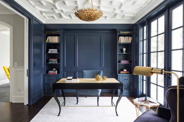
The wall and trim in this transitional study room are painted with navy blue color. Specifically, the blue color used here is Benjamin Moore Hale Navy HC-154.
The choice of this deep blue color is simply right because it makes the study room more inviting. It means spending time studying in this room can be more comfortable.
Besides, the deep blue shade also looks calm and relaxing so it will be easier for everyone to focus on the study in this room.
Another good thing about this wall and trim color is dark but not as dark as black.
While choosing black for study room can create a slightly depressing atmosphere that will only ruin study time, this navy blue color is an excellent alternative to take into consideration.
Away from the fact that the deep blue color of this study room creates a positive, inviting look, there are at least two inspirational ideas you can find in the study room picture above.
You should take these ideas into consideration since this will make any room with deep blue wall and the trim color looks better.
The first idea is located on the floor of this room. As you can see, there is a bright neutral color area rug placed on the room’s floor.
Something like this is not only found to create balance since the room is filled with dark color but is also found to avoid the room from looking too dark because the flooring also has a dark color.
The second idea is related to the use of wall-size glass windows in the room. Again, this is related to the way to avoid the room from looking too dark. With enough source of natural light like this, the need for adequate light in the room is properly filled.
Another example to inspire you in using deep blue wall and trim can be seen in the picture below.
In this contemporary living room, which also functions as a reading room, the deep blue wall and trim paint used is Benjamin Moore Newburyport Blue HC-155.
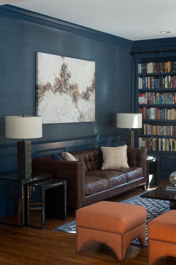
Besides the fact that this room also has an inviting look as found in the previous example, there is another plus point can be found in this second case.
It is that same color wall and trims like this has a highlighting ability that boosts the prominence of other items in the room.
In this design, the extra prominence goes to the books, tangerine ottomans, and wall painting.
2. Deep Colors for Cozy Interior
If previously it has been explained that same deep blue wall and trim color can build an inviting interior space, you need to know that same color wall and trim in other choices of deep color can create cozy interior space.
Cozy atmosphere like this is not only suitable for living room in which people usually gather.
This can also be taken into consideration for a room in which higher quality comfort is needed, such as a bedroom. An example of a way to use deep color wall and trim can be seen in the picture below.
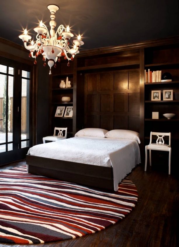
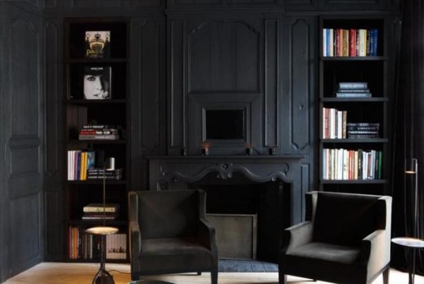
The black wall and trim as well as the dark color of the ceiling, bed, and hardwood flooring provide a cozy look in the bedroom area.
Besides, since most colors in this room are dark, it will be easier for the occupant to rest his eyes comfortably especially when he is tired.
One thing that is often worried about when applying such dark and deep colors in an interior space like this is that space will become too dark. However, solutions are already provided in this example.
The first one is the beautiful white glass chandelier that looks so prominent on the black ceiling. This chandelier gives the room enough light without being too bright so it will not ruin the deep look in there.
The second one is the wall-size glass door and windows. They provide adequate natural light from outside so the room will not look too dark especially at day.
Another way to avoid a room with deep color wall and trim from looking too dark can be seen in a picture example in the following.
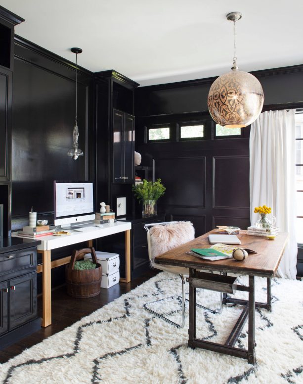
If the first example above the only count on artificial and natural light to make the room bright enough, this one also counts on something else. It is the use of bright neutral color in items placed or installed in the room.
Specifically, the bright neutral color used in this transitional home office design is white. This color can be seen in the curtains, computer desk, and fluffy area rug.
The last but not least inspiration you can follow when using the deep color wall and trim is that you do not always have to use paint with a glossy finish.
Using matte finish is a great thing to do too because it makes the whole interior to look more modern. Check out the picture under as the example.
3. Light or Cool Grays for Luxurious Look
The next color you can consider when you want the wall and trim in your space to have the same color is light or cool gray or the combination of light and cool gray.
This color type is recommended for you to choose because it can create a luxurious look.
This will work better when the gray paint color you use has explicitly silver gray shade. Although so, the example that is about to be provided to you in the following does not contain any silver gray wall and trim.
To give you more choices of light and cool gray wall and trim, blue-gray paint is the example you will see in the picture of contemporary Victorian bedroom below.
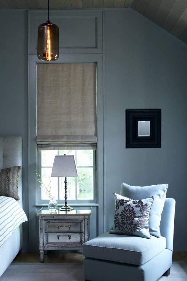
The type of wall and trim paint used in this bedroom interior is included in the category of blue-gray, which is not only light but also a cool shade of gray.
Unfortunately, the brand of paint used in this design is not known very precisely.
However, if you are interested in using the same wall and trim idea, you only need to look for a cool and light gray paint that has blue undertone in it.
An example that may be suitable for this idea is Farrow-Ball Blue Gray No.91. The blue undertone of this paint can be seen in the different level of visibility depending on the light available in the room.
No matter what the blue-gray paint you choose for the wall and trim in your interior, from the picture above it is seen that besides the luxurious but straightforward look, light cool gray paint also can create a peaceful and relaxing look.
Something like this is especially suitable for bedroom area just like the one shown in the picture above, right?
4. Warm Grays for Inviting Modern Look
Same gray wall and trim can also create an inviting modern look. However, especially for this look, the type of gray paint that you have to use is light and cool one as told in the previous subheading.
In this case, the more suitable type of gray paint to use is warm grays. Of course, it means that greige is the primary choice you need to take into consideration.
For example, please take a look at the traditional kitchen picture below.
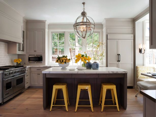
The space available for this kitchen area is not too small, but at the same time, it is also not too large.
However, the designer is successful in making the cooking are looked inviting so people can feel comfortable spending time here.
One of the ways that are applied here is by using greige wall and trim. If you are curious about the brand, it is Benjamin Moore Hazy Skies OC-48.
There is a thing that is found to be inspirational from this design. Because of the use of wall cabinets as storage space, usually, wall that is visible in the kitchen area is not too large.
About the use of greige wall and trim in the design example above, this may result in less inviting and modern look.
However, a solution is already provided in the design above. It is by painting the wall and floor cabinets in the same color with the color of the kitchen trim and wall.
This way, greige can still be the most dominant color in the kitchen that is meant to build the inviting atmosphere and look in there.
Another good inspiration can be found in this kitchen design is that same color trim and wall has the highlighting ability, which makes items placed in the interior space to look more prominent especially when the colors are quite outstanding.
Here, the highlighted color is yellow that comes from decorative flowers on the island and stools placed as pairing to the kitchen island.
All the same color wall and trim have highlighting ability as explained previously. However, white is known to be the best. Further information about this can be found in the next subheading.
5. White for Clean, Visually Expansive, and Highlighting Look
The last but not least suggested color for same wall and trim is white.
This is the color you can always choose when you feel doubt about choosing the other four colors explained previously. White trim and wall will never fail.
There are at least three looks can be resulted from the use of white paint color on trim and wall.
The first one is a clean look. This look is often used in the kitchen area. Although so you can use this in any other rooms in your house if you love fresh impression in your interior.
The second look is the visually comprehensive look. This cannot be separated from the fact that white is the ultimate neutral color that is just perfect to be used to make a small interior space to look more expansive or spacious than it is.
The example of this is shown in the picture below.
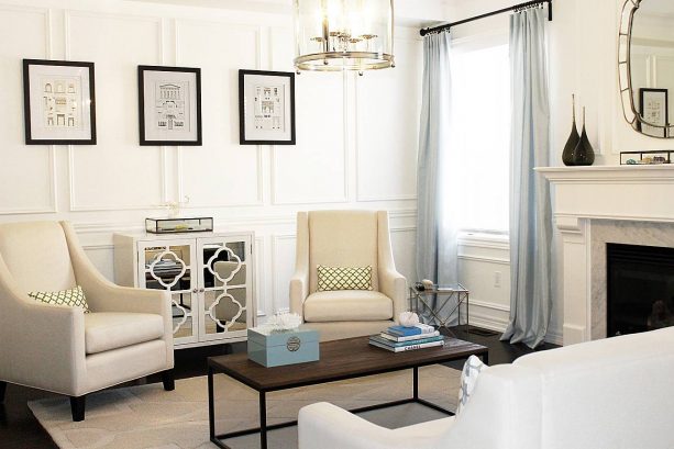
This living room has wall and trim that is painted in the same white color. Visually, this paint color is very similar to Benjamin Moore Cloud White 967.
As you can see in the picture above, the living room is rather limited in space. In this case, the white trim and wall are significantly helpful because it can make space looks more spacious.
It is even better because the living room also has a window that even it is not too large it faces the right direction where natural light comes from and can enter the room efficiently as the artificial source of light.
Besides, the choice of sheer curtains instead of the solid ones as covers for the window is also found to be supportive to the need of adequate light, which is also needed to create a visually expansive look
Another detail that you should not miss also is the mirrored chest. Even if the size of this furniture is rather small, the mirror feature it has also helped in making the room to look bigger.
The next is about highlighting the ability of white trim and wall. The meaning of this is none other but the ability to make one or more things placed inside to look more prominent that they can steal most attention in the interior space.
This ability can be explained better when you take a look at the picture of transitional bedroom design as followed.
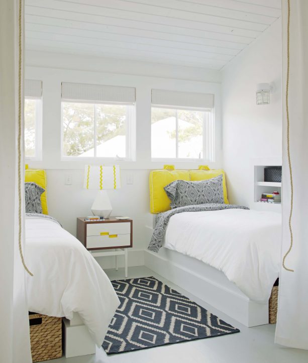
By the help of the Sherwin Williams Extra White 7006 color on the trim and wall, several items become the highlight of this bedroom.
The first one is the yellow cushions that are uniquely used as headboards for the white single modern beds. The second item is the vintage brown bedside table, which drawers’ front is painted in white color. The last thing is the white table lamp that is decorated with a white shade that has yellow stripes.
So, those are the five best choices of color you can consider when you are about to paint the trim and wall in your interior.
As already explained in each subheading, each color gives different visual effect, so you need to think carefully about what you want or need before making a decision. When in doubt, you can just choose white color since it is always non-failing.
Although most colors mentioned above can be paired with any other colors easily, you still have to think carefully about different colors you want to place in the same space after picking a choice of same color trim and wall.
This is done not only for the same of compatibility between colors to another but also making sure that every visual effect produced by each color listed above can be shown most efficiently.
So, which one of the five choices is your favorite?