
Best gray paint colors Sherwin Williams are not only limited in colors that are considered as true gray options but also greige options.
As you may already know, greige is the type of paint color that gains more and more popularity nowadays. It consists of the combination of grey and beige colors, which also means that it gives warm tones to gray that has long been known as cool color.
If right now you are looking for the best collections of gray paint colors that have been released by Sherwin Williams, no matter whether it is greige or cool gray paint color, check out the list of 11 most amazing Sherwin Williams gray paint colors below.
- Sherwin-Williams Agreeable Gray SW 7029
- Sherwin-Williams Amazing Gray SW 7044
- Sherwin-Williams Big Chill SW 7648
- Sherwin-Williams Colonnade Gray SW 7641
- Sherwin-Williams Dorian Gray SW 7017
- Sherwin-Williams Ellie Gray SW 7650
- Sherwin-Williams Modern Gray SW 7632
- Sherwin-Williams Pavestone SW 7642
- Sherwin-Williams Repose Gray SW 7015
- Sherwin-Williams Silverplate SW 7649
- Sherwin-Williams Worldly Gray SW 7043
1. Sherwin-Williams Agreeable Gray SW 7029
The first option is Agreeable Gray SW 7029, which is none other but one of the most popular gray paint colors by Sherwin-Williams.
When talking about this gray paint, there are several important things you need to know.
Agreeable Gray is a paint color that has a taupe undertone. This is not a strong undertone because as a matter of fact, it is quite hard to notice.
Although so, the undertone actually plays a quite important role. It is the one that has the ability to subtly keep the gray paint on the warm side and not letting it looks too cool.
Basically, this paint color can be included in the category of neutral paint colors.
Certainly, the fact that it has a subtle warm look makes is a great alternative to other neutral colors, including also white as the most ultimate neutral color.
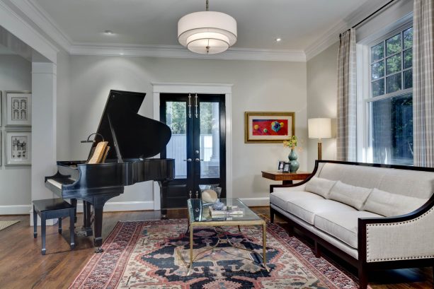
As an example of how Agreeable Gray is used in interior design, please take a look at the picture above. This is the picture of traditional living room design from a university.
In this design, the gray paint color makes the space to look cozy because the wall does not look too cool. It has a slight of a beige color in it, which is clearly caused by the undertone of the wall color.
2. Sherwin-Williams Amazing Gray SW 7044
The next option is Amazing Gray SW 7044. Actually, this one is considered to have a quite high level of similarity with Worldly Gray that will be discussed further in the last subheading of this post.
If being asked about whether this color is greige or not, it can be said that yes, it is suitable enough to be included in the greige category, which means that the gray color also has beige look in it.
This is something that is caused by nothing else but the brown undertone that is factually more suitable to call as a taupe undertone.
Although this can be said so, you need to know that the greige look is very subtle.
This makes the paint color still strongly have its gray look but it does not seem to go to the cool side since the greige characteristic tends to make it looks warmer.
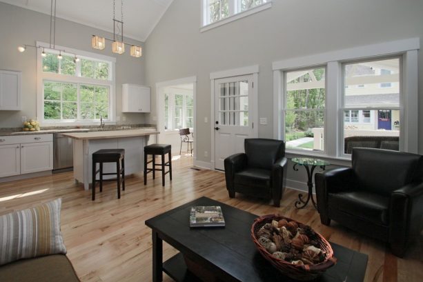
For example, check out the picture of craftsman living room above, in which the wall is colored by using Amazing Gray by Sherwin-Williams.
Clearly, in this design, the gray wall paint is not only paired with white color from interior trims and kitchen furniture and natural wood color from the flooring and countertop, but also with a bold color.
The bold color is none other but black, as you can see in the stools, leather chairs, and coffee table.
It seems the designer also makes sure that the colors combination in this living room does not only create a light warm and comfortable look but also something bold, which can possibly be something that the homeowner loves.
3. Sherwin-Williams Big Chill SW 7648
Big Chill SW 7648 is the next paint color you can find in Sherwin Williams brand.
This one is a bit different from the two paint choices above because it does not have that greige look.
As a matter of fact, this paint color has a slightly cool look. This is something that is caused by a quite subtle blue undertone the paint has.
Although it has a blue undertone, it has to be emphasized that this undertone is very subtle. This way, most of the time the paint color tends to look neutral.
In other words, this paint color choice is suitable enough to be included in the category of true gray paint.
Of course, although Big Chill is neutral it still has the basic characteristic of gray paint, which is looking clean.
This is also the reason why this paint color choice is suitable enough to be picked for kitchen area as you can see in the picture below.

One thing that is found to be interesting and inspirational from the transitional kitchen design above is that actually Big Chill is not used to painting the kitchen’s walls. The paint is a matter of fact used to color the kitchen island.
Clearly, the clean impression is the one that is built up in this kitchen space and it is proven by the use of dominant white color in the ceiling, window trims, cabinets, and countertops.
Even the color of the island is a bit darker because of Big Chill it does not ruin the clean impression.
Moreover, space also gains a lot of natural light that brightens everything up including the gray kitchen island.
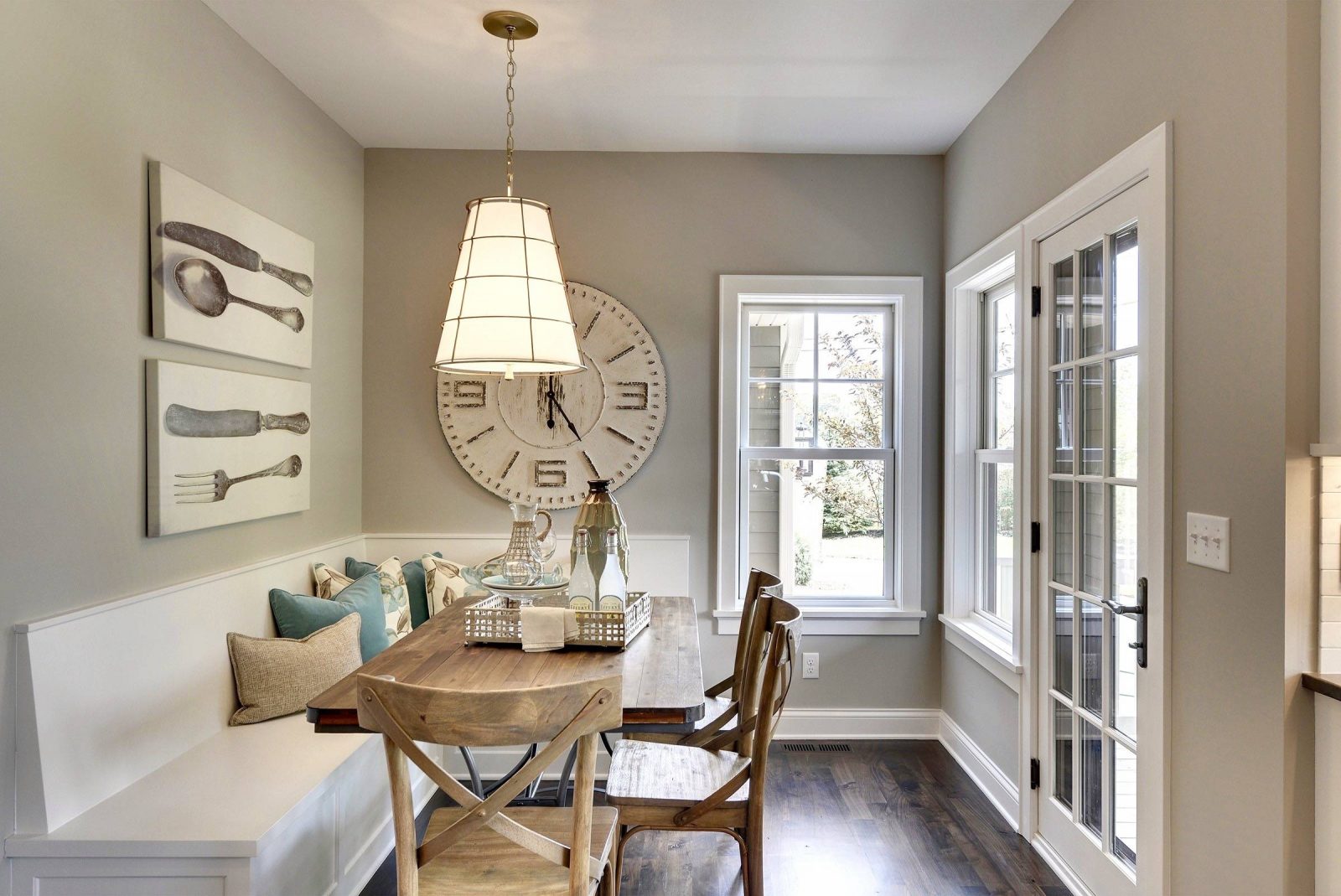
4. Sherwin-Williams Colonnade Gray SW 7641
In the greige category, the next best choice we can find is Colonnade Gray SW 7641.
Surely, because it is a greige color it has warm look but you need to realize that this actually depends on the light and other colors in the surroundings.
Besides, you also need to know that the greige look in this paint color is quite subtle that sometimes it acts more like neutral gray paint that will never change the temperature of the interior space where it is applied visually.
Even the greige look is slight you can still create an interior look that can make your eyes rest comfortably with this paint color as well as creating a welcoming space.
For you to know, this is not only limited to living space and bedroom space. If you want to, you can, of course, create the welcoming and resting look in any other room, as you can see in the example below.

Even the dining space can be said to be small and quite narrow, the use of Colonnade Gray for the wall creates something significant to the dining room design in overall. With this paint color, the dining room looks more welcoming.
A look like this usually makes people feel like spending time in the room eating or just having a good chat.
5. Sherwin-Williams Dorian Gray SW 7017
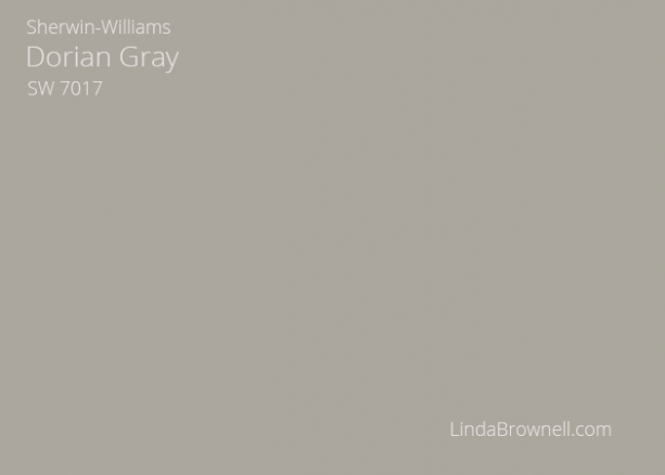
The next best paint color choice from Sherwin Williams is called Dorian Gray SW 7017. Generally, this paint color belongs to medium tone category.
This one is a very suitable choice to pick for creating beautiful interior space with not only soft but also subtle look. The cause is none other but the warmth that exists inside the paint color itself.
For a more beautiful look, it is so much better for you to use the paint color only in well-lit interior space. This way also you can see how the greige creates a warm atmosphere.
This is one of several reasons why this greige paint is considered more suitable for traditional interior design.
If you want to create a brighter interior space while using this paint, you can add white color to the room design.
As you may already know, white is always suitable to be paired with gray. For gray wall paint, white interior trim is definitely the one to consider more as a pairing.
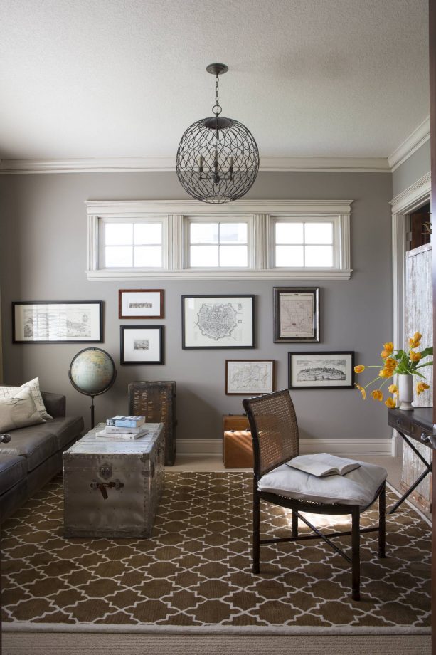
To make everything clearer, you can check out the image of contemporary home office design above, which can actually be functioned at the same time as the small alternative living room.
In this design, Dorian Gray is used as the wall paint.
As you can see in the picture, the office is quite lacking in natural light and it makes the space to look a bit dark.
Thankfully, the designer uses white interior trim and ceiling here so space can be brightened up a bit and makes it is more comfortable to use based on its main functions.
6. Sherwin-Williams Ellie Gray SW 7650
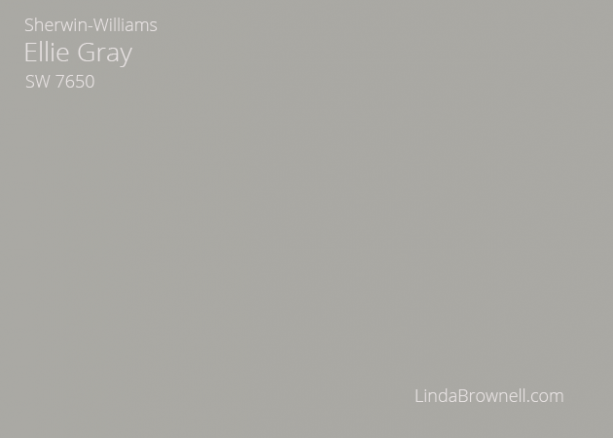
The next choice belongs to cool gray category. It is none other but Ellie Gray SW 7650.
The reason why it is cool gray wall paint is clear that it has a blue undertone.
Although so, the undertone does not make the gray paint looks cool in a bright and fresh way but more in a rather dark and subtle way. That is why the paint color is often said to have concrete look that is cool.
When applied to walls, this gray paint color tends to create a calming look. Surely, this is the one that is caused by the visual softness the paint has.
For you to know, this wall paint is also quite unique.
The reason is that even this is a cool gray it still has the ability to create warm and inviting looks that also make it suitable for some specific rooms like the bedroom, dining room, and living room.
The warm and inviting looks result from the fact that the color can also add visual depth to any interior space.

If you need an example of the application of this wall paint color in interior design, you can check out the image of contemporary dining room above.
There is something interesting can be found in this design actually. It is the fact that even the gray wall paint looks rather dark the rather small dining room still looks airy.
It is factually caused by the use of white interior trims and enough glass windows that allow more natural light to enter the space. This is surely something you can get inspired from when choosing Ellie Gray as your paint.
7. Sherwin-Williams Modern Gray SW 7632
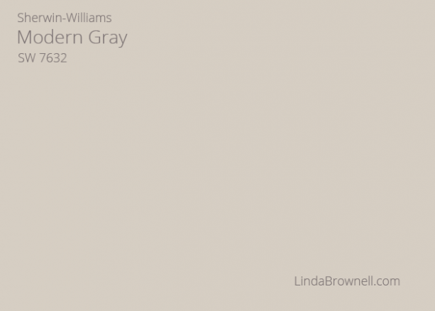
Modern Gray SW 7632 can be said to be an ideal choice when it comes to background color in home interior.
The main reason is none other but the compatibility that this soft and warm color has quite a lot of other colors.
For example, it is perfect to be paired with quite a lot of blue colors, especially chambray, denim, and navy blue, in a gathering area such as living or family room.
Other than that, this paint color is also suitable to be paired with some soft shades of green like olive particularly because it can make the green shades pops well in the interior space.
If you want to, you can also create a beautiful and soft look by using this paint color. The way is by pairing it with bright but soft color, such as cream. A combination like this can be perfect for the bedroom area.
Surprisingly, you can also pair this gray paint color quite easily with bright and pop colors. The examples are orange and fuchsia that seem to be quite popular right now.
As an example of how this paint color looks like in interior design, you can check out the picture of modern dining room above.
The modern impression that the designer wants to show off is visible quite nicely in the design because it is dominated by popular modern tones including gray and black.
Of course, Modern Gray SW 7632 wall paint is also included there.
In this design, the wall paint represents modern look in a way that is not bold. As a matter of fact, it looks quite soft, which at the same time also boost the comfort in the dining area.
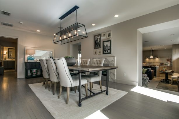
8. Sherwin-Williams Pavestone SW 7642
Another choice that is suitable to choose for creating beautiful, inviting, soft and warm looks is Sherwin-Williams Pavestone SW 7642.
Actually, this paint color is not only known to have greige look but is also known to have a green undertone.
Although so, the green undertone is very slight that it is almost invisible. This makes the greige look to be more visible and makes the paint color has the natural ability to add warmth to interior space too.
The warm and inviting looks created by this paint color make the paint very suitable to choose for entryway and living room. An example of this application can be found in the picture above.
As a tip in using this wall paint, it is much better if you use this paint in a space with adequate light. This will not only make the paint looks stunning but will also boost its slight earthy-toned look.
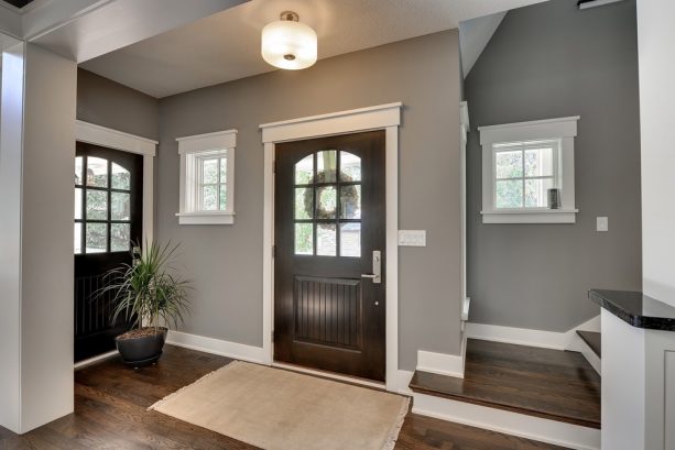
9. Sherwin-Williams Repose Gray SW 7015
Next, we have Repose Gray SW 7015 for you to consider. The best thing about this paint color is that this is basically suitable to use in any room in your house.
For the undertones, this paint color has both brown and purple undertones. Although so, you need to know that both of them are very subtle.
The very subtle brown undertone also makes the paint color not really suitable to be said as greige color. However, this does not make the paint color less lovely.
One thing that you have to be aware of when about to paint your interior space with Repose Gray it that although this is light color this will be weighted in a space that is rather dark.
In order to avoid it from making your home interior weighted down, it is best to make sure first that space has enough light no matter whether it is artificial light from lighting system installed in the space or natural light from the sun outside.

Another way can be done to avoid your interior to look shadowed because of this gray paint color other by considering about the room’s light thoughtfully is by placing bright colors in the room. An example of this is available in the picture above.
Some shades of orange and yellow are chosen as pairing for Repose Gray in this transitional living room design. Being supported at the same time with adequate light finally makes space bright, comfortable and cozy.
10. Sherwin-Williams Silverplate SW 7649
Another option you can take into consideration if you always prefer to choose cool gray paint color instead of the warm one is Sherwin-Williams Silverplate SW 7649.
Although it belongs to cool category, you need to know that the cool gray look it has is quite subtle.
One excellence that makes you have to consider this paint color more is that it is suitable to use in both dark and bright interior environment even the visual effects resulted are a bit different.
In dark environment, Silverplate tends to look heavy. On the other hand, when the environment is bright, it does not only look clean and inviting but also sharp.
For the best look, there are two interior elements suggested for you to pair with Silverplate. Those are hardwood flooring and white interior trim.
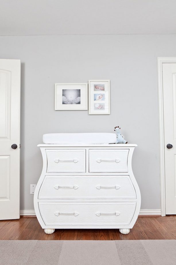
In the example above, you can see how Silverplate gray paint looks like in a well-lit environment. Besides, it also shows how it looks like being paired with both hardwood flooring and white trim.
11. Sherwin-Williams Worldly Gray SW 7043
The last but not least choice that is included in this list is Worldly Gray SW 7043.
Generally, this paint color is suitable to be included in greige type because it has quite light brown and green undertones that make the paint color has a subtle beige look to it. Although it can be said so, the gray look is a matter of fact stronger than the greige look.
In overall, the color of Worldly Gray is quite soft. That is why the paint is also well-known for its ability to build up a romantic atmosphere in any interior space.
As told earlier, Worldly Gray by Sherwin Williams is a paint color that is often considered very similar to Amazing Gray.
Even so, of course, some difference can be found. It is especially in the fact that Worldly Gray looks lighter than Amazing Gray. This makes the paint color a better choice to pick by those who always love lighter paint colors more.

Take a look at the picture above so you will know about how the paint color looks inside a room. In the example here, the room is none other but a farmhouse living room.
As shown in the picture, the gray wall paint does not only look suitable when paired directly with white trims but clearly creates a romantic atmosphere in the living room.
Besides, the room also looks cozy, especially because there are some warm tones used inside the room to complement the gray wall color.
Both types of greige and cool gray paint color that has been listed above are considerable, especially when you are thinking about redecorating your home interior.
Both of those types are not only found to be suitable to apply in almost all rooms but also known to have a specialty you can take into consideration.
So, which is the best one for you?